
There are many reasons why e-commerce giants such as Amazon, ASOS and GAP rake in big bucks while the others do not. These giants owe a lot of their success to the user experience of their websites, which caters to the need of today’s online shopper.
67% of millennials and 56% of Gen Xers prefer to shop online rather than in-store. These millennials and Gen Xers spend nearly 50% as much time shopping online each week (six hours) than their older counterparts (four hours).
Bad user experience is a killer for e-commerce. The main purpose of an e-commerce website is to attract and convert customers. If you can’t boost your site to present a smooth user experience, you are missing out on your share of sales.
Here are the 10 factors that lead to bad user experience on e-commerce websites;
Confusing check out process:
User experience is severely affected by a confusing checkout process. If you are failing to make your point, your customer is not going to guess it either. Amazon already simplified checkout for its customers years ago and pioneered the simple checkout process.
Consumers needed a simpler process with fewer steps. Amazon changed the face of e-commerce forever by leading the simple purchase process revolution. A complicated checkout process is frustrating for customers to say the least, and most websites lose out on sales because of it.
So, how do you simplify processes? Start by avoiding complication in the existing checkout process. Next, don’t force registration for a checkout. It’s better to leave it to your customers if they wish to create an account or complete the transaction as guests. If you’re selling nationally or globally, letting your checkout detect the right locale so that customers see the right currency and shipping info is a must – Amazon does this even for desktop shoppers. And it’s also a good idea to use a persistent shopping cart and make the checkout/shopping basket easily visible and accessible.
Poor product images:
When you visit a brick-and-mortar store, you have the ease of picking the item and examining it. An e-commerce store does not provide that experience, if there is no product photo. In order to buy a product, you need to see what it looks like. Internet scams are becoming ever more popular, which is why people don’t trust a store by its word only.
Poor product descriptions:
Visitors expect your website to be clear and straightforward in product descriptions. A photo without a clear and relevant product description may not give you a high number of sales. Badly written descriptions or the absence of descriptions devalue your product. According to KISSmetrics,
- Accurate product descriptions can influence buying decisions and can also be the difference between a converted customer and a lost lead.
- The product page is the last page a potential client sees before proceeding to checkout. This means you have a final and critical chance to secure their purchase.
- Many e-commerce retailers make the mistake of using product descriptions provided by a manufactuer of third-party marketing organization. These are usually short, tasteless, unappealing, and may result in duplicate content.
There is a huge difference between product specification and product description. Descriptions are when you become a virtual salesman and explain how the product should be styled, what you should avoid and how you can maintain its look. Good descriptions are also good for SEO on your website as there is more space to use certain keywords and to possibly include a backlink. Look at Bluebuds’ product description;
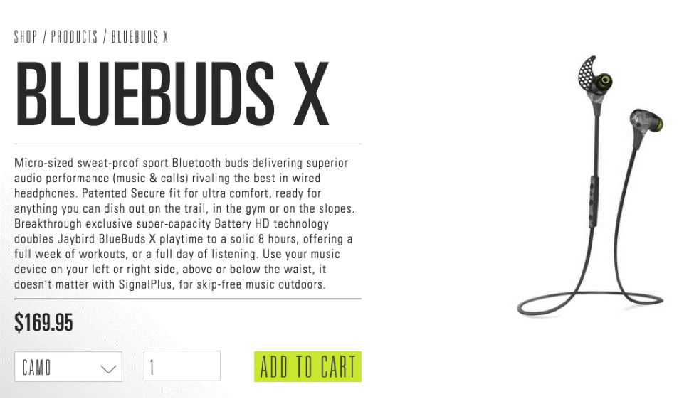
After reading a description like this, it’s unlikely that a potential customer will be unsure about buying the product.
Not optimizing for mobile:
If you are not thinking about optimizing your website for mobile, you are losing customers every day. Optimizing websites for mobile is no longer an option, it is now a necessity. More people are buying mobile devices with every passing day, and you are missing the chance to turn them into customers. If you still need motivation, look at what Google has to say about mobile optimization and conversion rates.
If you want to reach people on mobile, you’ve got to start with the basics — a mobile site. Though it seems obvious, this study found that 96% of consumers have encountered sites that weren’t designed with mobile in mind. It also found that when it happens, it can be bad for business — 48% reported feeling frustrated and annoyed.
Weak CTAs:
The worst thing you can do to your website is miss out on usage of quality calls-to-action (CTAs). CTAs guide your user to take the step you want them to take. Because the user doesn’t know what to do after visiting your site, it’s important you clearly tell them. Moreover, weak CTAs can actually annoy customers and lead to an increased bounce rate.
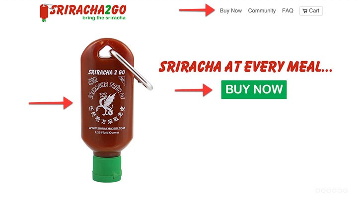
Make sure that you have clear categories, filters, descriptions and upselling options. Colors, buttons, website copy, images and fonts can be powerful CTAs to direct your customer. Look at this Sriracha brand, which is leaving nothing to the imagination when selling their product:
They have included all the details a customer needs to buy a product. If you can’t decide on your strongest CTAs, you can decide through user testing.
Adding too many features:
There is nothing wrong with too many features, but what if they are harming your site more than helping it? People who visit your website are looking for specifics. If you confuse them with too many features, it can possibly deter them from further exploration or they might become lost as to why they came to your website in the first place. This problem will not arise if you do your research and abide by the rules your site analytics set for you. You can’t create an ‘everything you can buy’ shop with too many features.
After spending considerable time in the business, you will start noticing which features are liked by customers. When you make an experience map and go by its deductions, you can cut out unnecessary elements from the picture. If you still end up with more features than you would like, try to align them with your business goals and compare the rates of their success with the objectives they help you achieve.
Copying competitors:
Your e-commerce store is no less than a real-life store. It’s just available on the internet, that’s the only difference. In real life, any retailer would be horrified if their shop looks exactly like their competitor’s. Don’t make the mistake of copying your competitors on the internet. The temptation to offer the same features competitors offer is really strong, but don’t give in just for the sake of sales. Your store must look unique and customers should be able to distinguish it from others.
At the end of the day, you can always A/B test features on your pages to see if they accomplish business goals or not. Just because a competitor has a feature, doesn’t mean it is accomplishing their business goals. Design a website which is special to your type of business and provides value to people who visit it.
No trust signals:
Many customers decide against shopping from a website because they think that it is not trustworthy. People hesitate to enter their credit card details on an unknown website just because of the lack of trust signals.
E-commerce websites fail to establish trust by missing out on this tiny, but important detail. Don’t burden your customers with the task of doing all the thinking in the limited time they spend on your website. Starting from the ‘HTTPS’ signal on the address bar to the safe payment logo under your payment details, make sure you are enlightening your audience with every trust signal that’s relevant. Customers will be assured that their transactions are secure.
When outsourcing hosting, customer service and other things, make sure you keep security as a strong measure. Every country has a certain level of security practices which you need to get verified when you launch your website. Show this in the form of a trust logo to your customers, that your site is secure for business. CrazyEgg claims that your site will die if you don’t pay attention to trust signals.
Trust signals, put simply, are features or qualities of your site that inspire trust in the mind of the customer. Trust is what allows a customer to go from visitor to buyer. A user needs to trust a site in order to buy from the site. There are hundreds, potentially even thousands, of different types of trust signals. Some trust signals, however, are more important than others. These are the signals you shouldn’t avoid:
- Testimonials
- Contact form
- Payment assurance

No store information:
One of the most annoying things on an e-commerce website is the lack of store information. How are you expecting the customer to do the math? Some items are more expensive, and while making the buying decision, the customer requires necessary details like shipping and return information. Online store details guide the buying decision to a great extent. A well-thought out return policy is also an important feature in e-commerce. This one is not an excuse at all – you need to have all the above information clearly displayed on every page of the website!
Some websites do this by creating an FAQ page, while some list the policies on a separate page. You can be saved when a customer wants to return or exchange something.
Poor or no customer service:
Many retailers on the internet think that e-commerce begins and ends at listing products on the site’s pages. They overlook the details which make e-commerce websites different from a brick-and-mortar store. Serious shoppers take their time to browse through pages and every detail is considered. The buying decision of a customer depends on the way your website is shown.
In most cases, a serious shopper would like to contact customer service regarding a product. If there is no customer service link on any page, that would be a huge disappointment. If there is a customer service page but the customer never hears back when they send a query, that customer would never return to your shop again.
It all comes back to trust: How will a person believe that you are credible when they can’t even reach out to you? It gives an impression of a weak business, or one that ignores customer satisfaction.
Businesses like Amazon keep their customers in the center of their strategy, and are evidently more successful by doing so. Never make your customer feel like you aren’t interested in hearing what they have to say. Newest e-commerce technologies have provided options to incorporate live chat on every page which can be used to summon a customer service rep instantly.
An ATG Global Consumer Trend study found that 90% of customers consider live chat helpful and an emarketer.com survey found that 63% were more likely to return to a website that offers live chat. “62% reported being more likely to purchase from the site again. A further 38% of respondents said they had made their purchase due to the chat session itself. All these attitudes were even more prevalent among respondents who bought online at least weekly.”
Last word:
E-commerce businesses need to stay updated with trends and incorporate changes into their website to avoid user experience issues. Make sure you are frequently user testing your site pages and eliminating any element that doesn’t boost conversions. The purpose of your website is to drive more sales, and if an element is a hurdle in the process, it needs to go. Look at your website from the eyes of your customer, it is a surefire step up in the ladder to success. If you need any assistance with the user-experience design of your e-commerce website, feel free to reach out to one the best Orlando SEO Company.