Designing a high converting landing page is the key to your successful marketing campaign. Setting a goal, designing, getting qualified leads and optimizing your landing page can be a result of high conversion, the average conversion rate of most landing pages are 2% to 5% but we are not here for average landing page design, we are here for landing page which convert 2-3 time more than the average landing page do.
The key element of getting those pages done, is more of (UX) User Experience job than that of (UI) user interface. It may be that you have an out of the box solution for a creative page but if its not converting then it has no purpose. The design may be the secondary part of these landing pages but its total folly to ignore it.
So, first we need research on how users land on this landing page, interact with information and convert to a paying costumer. When users land on these pages they have certain expectation (Like you are willing to give them free trial for 1 month, or you promise them to give high speed analytics software for finance) these expectations build up when they see your ad campaign. Fulfilling user expectation when they land on your website is most likely the result of high conversion. You can fulfill these expectations by asking some questions before designing the landing page.
Before you start:
There are some pre-design experiments you may want to consider before digging into design/prototyping process:
What is the main purpose of landing page?
Either it is the lead generation or click through page
What is the projection market?
Who are your costumers? What style or designs are they most comfortable with? These are all questions that need to have answers in your head. Design elements appeal differently not just from audience to audience but from context to context.
What are the need and expectation of potential customers?
Your potential customers are expecting solutions for their problem from you. Either they have bad experience with other software or just have a specific need, e.g. they are looking for something which save their time, for this they are willing to pay a higher price, or there are customers looking for affordable products, and they can compromise on speed.
Defining the single goal at a time for landing page is often the best strategies you can have.
1. Go without navigations
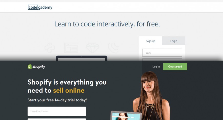
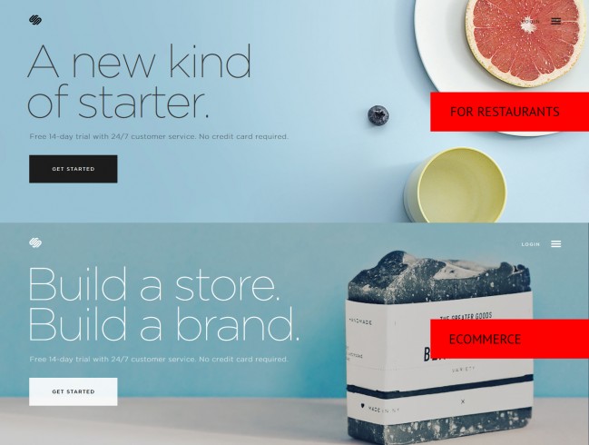
Landing page is not a homepage: that needed to be said, it is a dedicated standalone page designed for one specific purpose, a great landing page must not have navigation or other links for more focused conversion.
2. Divide things in sections
The effective landing page are divided into sections/scroll, the standard size of each scroll must be under 600px in height. Groping the information in section will help the user understand what you are trying to communicate. For just starting out, you can follow these structures and optimize it as you get results of user interaction with the page.
- – Logo, Main Message, CTA (First Scroll)
- – Features (3 to 6) do not overrun them with tons of features
- – Second CTA (Optional)
- – Social Proof/ testimonials/ Blogs (with Links to Independent source)
- – Final CTA
- – Footer
3. Deliver effective message
Sending out effective messages is the most important part of your landing page, it is the line which summaries the whole product or services you are trying to communicate with the user, and for that your message must be simple and effective. Something that motivates them to convert and if its not selling well, then it is the first thing to optimize. But keep things simple.
4. Instant sign up with minimum information:
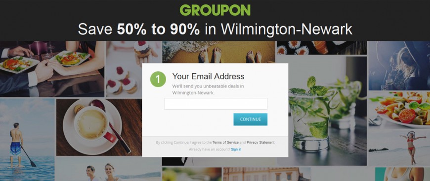
Let say you have a great product ready for the costumer, and you have a potential lead on your landing page, but you have so many form fields like Personal information, Financial, and Mailing information, but on the way down the consumers didnt have their Credit card with them so they are not able to buy it from you, you might lose a lead because you ask far too much? Right!
On the other hand, you can just ask for their Name and Email, to signup, before pushing them toward the buying page. Plus if you feel they are lost between the processes, you can convert them in a follow-up process by sending them email later because you have their email.
5. Benefits vs features
Lets say you have a great product which has a great host of many features but lists only those your costumers you are searching for. List them in a way your potential customers feel connected, in a way that they feel it is precisely what they asked for. It must be more about them less about what you wish to sell e.g We invent the real-time optimizing tool vs optimize your website in real-time
6. Social proof and supportive information
Social proofs play big roles in conversions: these can be in the testimonials, tweets, blogs and endorsements your costumer posts online or through follow up call or emails. Independent source like tweets and feature post are more effective than just posting the quote from your survey or other self-generated materials.
7. AB Testing
AB Testing is the most technical part of your ad campaign for optimization and enhancements. Experimenting with Color, CTA Sizes, Positions and text can amplify your conversion rate by 2 or 3 times. But experiment with a single element at a time or you may end up wondering what change makes the most impact on optimization.
Remember human interactions are not a mathematical formula: every user behaves differently when they interact with your ad campaign by using the collective behavior you can optimize your landing page and achieve the goal you have in mind. Dont be upset about it, if you didnt get the high conversion rates rolling immediately. Constantly learning about your customers behavior and then evolving your strategy is the best way to get high conversions rolling. The first of your failures, are merely stepping stones, use them to your advantage.