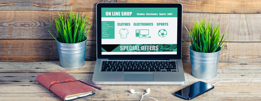
The homepage of an e-commerce website is like the prime time TV slot on national TV. They are the doorways that lead to more conversions on your online store. Only the best of products can be placed on the main page of your website. Just like the storefront of a brick and mortar store, your home page must have a great display of products the user would love to buy. The homepage is the place where you set up an enthralling display that urges the user to splurge on your website.
Many e-commerce business owners wonder if they should place products on their homepage. It is a tricky question because this might lead to information overload. You don’t want to confuse your audience by spilling all your gems on the first page. Homepage optimization is an art, one which you should learn to master as soon as you set up the website.
Both the creative and technical presentation have to work seamlessly together to create a great first impression. Of all of the elements involved, high-quality product images are the most effective design element you can use to communicate the quality, experience, and value of your products. –Mark Vanderland
The Search Box
Firstly, set up a search box in a prominent position on the homepage. If a user is accessing your site through a recommendation, they should be able to find their desired products directly through search. The search bar should be present in the top corner of every page. It gives the impression that the search is always there when you want to jump to a specific product.
You can also make the bar float as the users scroll down the home page viewing items. When it floats along the scroll, it is always a click away for the user. If you don’t have enough space for search bar placement, you can be creative and make a bar which expands when you click on it.
The Navigation Bar
The thing which complements a search bar the most is the navigation bar. The bar is usually present on the left. Search bars are often found inside the navigation bar. You should place a navigation bar prominently and put up a clear icon for the user to click and expand. Online shoppers need to find what they are looking for, in the least period of time. Navigation bars help in breaking down products by categories and pages.
If you fail to guide the user through your website navigation, they might leave your site in under 15 seconds! Place the navigation bar in the ideal position- top left. You can also make a navigation bar that stays consistently on the page without the need for expanding. It is up to you to keep the bar fixated on the top/left and put the search box inside as well.
A case study proves that fixing the navigation bar on the home page improved a brand’s conversions by 102.58%. E-commerce businesses can always design the navigational structure which suits their website in the best way.
Customer Needs
To choose the best practices for your e-commerce home page, you need to know your customer’s needs. When designing an e-commerce page, ask yourself ‘what do my customers want?’
Focus on the user experience. Make a homepage that caters to the right audience and becomes a conversion magnet. Most e-commerce pages get the most traffic on their homepage. That’s why you must design it to please the buyer. In brick and mortar stores, the latest fashion always makes it to the storefront. Similarly, homepages of e-commerce sites also contain the most lucrative deals.
Heavy Machinery dealer eQuip Sellsit’s click-through rate increased by 26 percent in one year when they simply moved around some elements on their homepage. They already had a big site with lots of traffic, but the overall navigation was too overwhelming for users. They moved things around to benefit the most from their traffic. Later, they developed a dealer portal to add listings to their website, which boosted traffic massively for the website. eQuip was an online store, but they didn’t leave it there. The e-commerce retailer launched a magazine with more than 25,000 issues printed. It added more to the brand’s value and recognition across the industry.
Heatmaps
Get accurate data about the activity of your users on the home page. Where they are clicking the most? How frequently are they visiting a page? Collect this data so you can design pages accordingly. If the users are not accessing a part of the site, it should be eliminated or kept on low priority. Combine this data with Google Analytics, and you have a formula ready for the best homepage.
Strategy
Once you know the needs of your customers, you can manage what the home page will look like. The page should speak to the customers. Design it in a way that it becomes all about the customer. All your latest deals and offers should be on that page. It’s not about pricing. It’s about how your products can change someone’s life. Keep designing and get the best homepage through A/B testing.
A/B testing is the best way to determine what makes the customers click, literally! The procedure is simple, you subject your users to different versions of the same page at the same time. The response you record will tell how popular a page is for the users.
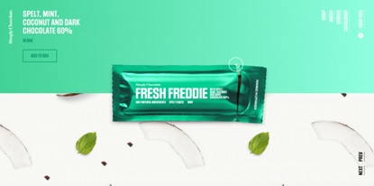
Simply Chocolate is a business based in Denmark. Their website is a good example of minimalistic home pages that places special emphasis on the product/s listed there. The vibrant colors of the site provide aesthetically pleasing visuals to visitors. The floating chocolate bar looks attractive and makes a viewer want to have that chocolate bar as soon as possible.
Behind every bar, the ingredients are displayed in a patterned photo. It adds to the value of the product on the homepage. These are displayed all over the page because any extra text or details would become too overwhelming for the user.
Tip: put products in the center and pay all importance to the product to make them look like the most important element of a page when the user visits your homepage.
Responsiveness
Not that long ago, e-commerce retailers made separate websites for mobile and desktop. Nowadays, we are watching the trend shift to mobile websites. A responsive website is the new norm. A codebase is applied to the site, and the content is displayed a bit differently to provide the best view for multiple devices. This is the e-commerce site of today, and Google has promised to make it a ranking factor.
Responsive design is Google’s recommended design pattern. –SEL
You have three choices when it comes to such a design:
Responsive design: This design is made possible by proportional grids and varying CSS. They provide different user experiences in mobile versions and fit in every device size. The overall flow of the website remains the same in responsive sites.
Adaptive design: Google refers to this as the dynamic serving. These have the same structure of URLs, but the difference is the detection. They detect the file sizes by picking up a different version of site HTML. This kind of site will have multiple versions.
Separate mobile design: this is also referred to as mDot. This kind of configuration serves differently on separate devices and contributes to flowy site navigation. It has been reported that 54 percent of online retailers have been using this kind of site.
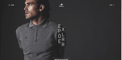
Polo Fangio makes really impressive Polo shirts. If the shirts were not remarkable enough, the brand has outdone itself in website view. Fangio is a household brand, serving those who like to sport everyday fashion. Everything on this website is organized to give a calm and composed look. This look completely resonates with Fangio’s brand image. The homepage is dark and impressive, with text neatly lined in both corners. Photos look real, and the subject is closest to detail.
Contact
You must mention a contact number and email address link on your homepage. The link will take users to a page where there can be addresses, forms and phone numbers for customer service. Customer service queries should be entertained by the brand at all costs. If you don’t put these details on the home page, new users will not trust your brand. The Internet is full of scams, so you should avoid any confusion that can drive customers away from your store.
Display trust signals on your site, so the users do not fear a scam such as credit card fraud. Your home page must be built to counter this fallacy. For more details read why people are afraid of e-commerce.
Remove Carousels
You have experimented with them for too long, and it is time to let them go. Carousels slow down your website, and they are difficult to read in one go. They are also intimidating for the new user. They are also not SEO-friendly. Go for good quality static images that contain a clear call to action. If you want a carousel, choose one which stops when the cursor is hovering on it.
In a case study on carousels vs. static images, the result showed that carousels earned 2.96 percent clicks while static photos earned 40.53 percent clicks. This tip is not to drive you away from carousels. They look great, and they deliver many messages at once. Here is just another perspective towards carousels in e-commerce home pages.
Verdict
Buying from an online store is an entire journey for a customer. Some brands plan it really well and bring customers over to their website from social media and email channels. Some brands get referral traffic on their home pages through multiple sources, and word of mouth helps as well. When a user lands on your home page, they expect answers and solutions immediately. If the solution is not in front of their eyes in a few seconds, there will be no deal. Only some users have the patience to wait around while a page loads.
When the user lands on a page which promised something else in the link and did not deliver it, your brand image gets affected by this diversion. Homepage optimization is immensely important for e-commerce retailers. A well-designed homepage gives a head start to the users regarding their purchase decisions. If the customer has landed on the home page without the intent of buying, your search bar and navigation will be key markers in motivating them to browse the store.
Intelligent retailers know that the buyer needs to be told what to do. You have to set up your homepage in a way that is unmistakable. The customer of today is ruled by ‘micro-moments.’ If you think that a past customer will land on the home page and make another purchase, you may be wrong. Any mention of your brand on social media, or a marketing campaign can bring them to your site, and if the site is not welcoming, they will bounce off.
Keep A/B testing any new version of your page and give the customers what they love to see on your site. If you have any tips regarding homepage optimization, share them below.