
Are you looking to start your own e-commerce store or a website, or are you confused about integrating Shopify e-commerce into your online store? You’ve come to the right place. After searching through hundreds of successful e-commerce stores on the popular e-commerce platform Shopify, we’ve come up with the list of the 5 most innovative and creative stores hosted on the platform.
Shopify is a platform that provides turnkey e-commerce solutions to its users and makes the life of an e-commerce entrepreneur easier. There are above a million stores that use Shopify as their platform, and those who keep factors like design, content, personalization and latest trends in e-commerce in consideration when devising and implementing their e-commerce strategy are the ones that stand out. Now let’s talk about the 5 outstanding e-commerce brands on Shopify during 2017-2018.
1. SCRATCH COFFEE
What we love the most about this store is that it really starts to deliver on the ‘WOW’ factor as soon as you open their website.
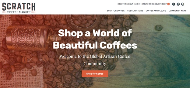
The design is sleek, modern and not overly done. It gives you a warm fuzzy feeling (exactly like a delicious, warm sip of your morning coffee would make you feel) and you can feel the coffee beans stirring in your veins already. A stunning imagery is displayed on the slider along with a strong call to action button.
You scroll down a little bit and the next thing you see is a video.
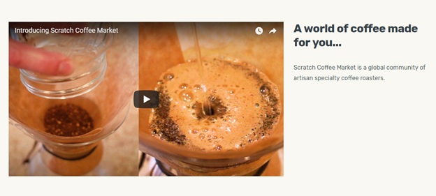
Video content is one of the strongest ways to portray and market your brand. It helps connect you with your customers and it is much more exciting than the boring old text. Especially in the food and beverage industry, videos have a lot more impact than just mere text. Even the images attract more attention than the plain old text. The store could’ve written loads and loads of content or maybe just even a paragraph singing their laurels and accolades, but they chose not to. They had it all summed in a short, engaging video.
This is 2018, the consumers are becoming savvier by the day and are making more informed purchases now. Social proof is a great way to put your first time visitor at ease.

Scratch Coffee does that by displaying the list of brands that are using their coffee. There are several brands on this list which adds to the value of the brand. A visitor who would be visiting the store for the first time would most definitely think that if all these brands are using their coffee, why shouldn’t I?
The place where they display their products, as you hover the cursor over the products, two calls to action buttons pop-up. There’s an Add to Cart button and a Learn More button.
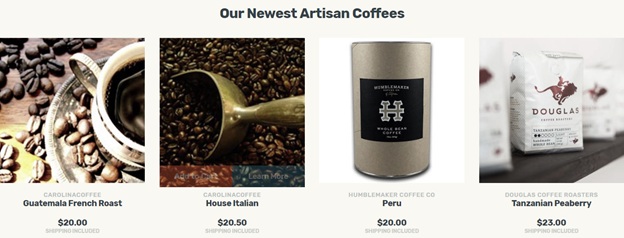
What we really loved about this website is how they are inviting visitors to join their mailing list.

JOIN THE INSIDERS. It creates excitement and suspense for someone who is visiting the website for the first time and would love to know what they send out in their newsletters. This feels exclusive and exclusivity results in more conversions.
2. SOLO STOVE
Solo Stove is a unique Shopify e-commerce store that sells stoves for individuals. The idea is unique and holds a lot of potentials, especially for the people who travel and camp. The website design is bold, modern and uncluttered.
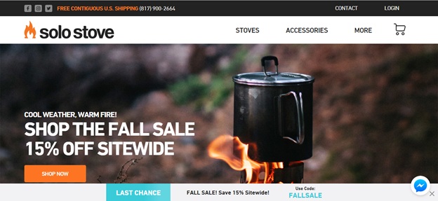
The imagery here is good to luck at and the call to actions are strong. The Facebook messenger plugin is also connected to the website, creating an easy option to connect with the store and hold a conversation.
Right after this, as you scroll down, Solo Stove adds the list of publications where they have been published.

This creates trust amongst the people who are visiting the website for the very first time. Publications add to the credibility of the store and some of the names included in the list are huge brand names.
Moving on to their products, product photography is amazing. The pictures are shown in context with vibrant colors displayed all over.
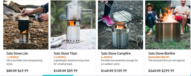
This is not your average product shoot. The pictures are clear, engaging and show something exciting happening with the product.
Then, they explain how their technology and designs work in text and illustrations format. As you scroll through these 5 steps, the illustrations on the right explain each step perfectly and you understand how the product actually works.

And they add some more social proof with the store displaying Instagram photos of the customers who are using their hashtag #SoloStove.
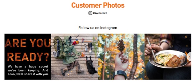
According to a study, customer photos help boost your conversions by a whopping 19%.
3. SO WORTH LOVING
We understand that generating sales and ROIs are the most important factors of an ecommerce. The human connection element, however, is often ignored. There’s not many stores that connect with their customers better than So Worth Loving.
If you move to the ‘Our Story’ tab on their home page, this is what you see. Genuine appreciation by using the terms WE BEGAN BECAUSE OF YOU. This builds customer loyalty like nothing else.
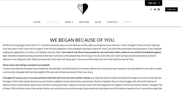
There’s a personal connection in the story as well which makes the customers connect with the brand in a much better way.
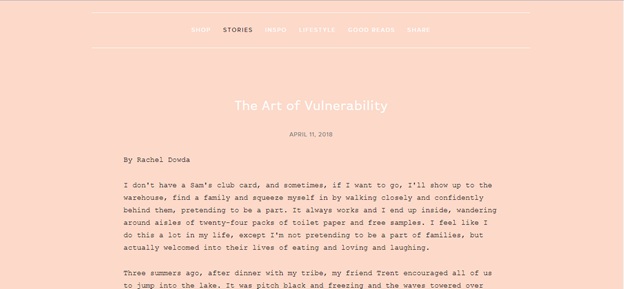
So Worth Loving is a community instead of just another e-commerce store, the customers connect with the brand, follow it, love it and share their stories. Their blog is a great example of that where customers share their stories with the brand. Customer photos are one thing but customer stories add way more authenticity and help a lot more in the community building than a photo does.
4. BAN.DO
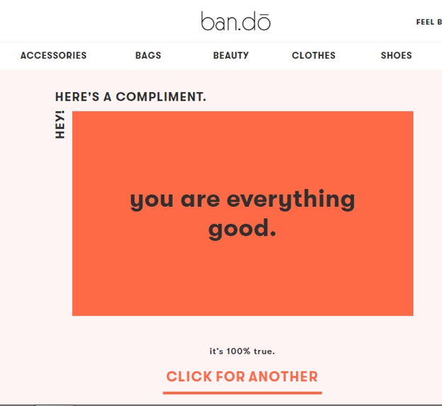
Before we get into any other features of this store, there’s this amazing compliment tool on the website that generates compliments for you. A little uplift is all that someone needs on a bad day, don’t you think?
The lifestyle brand Ban.Do is colorful, vibrant and fun. The website is great to look at and gives out positive vibes.
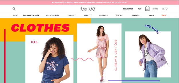
The colors used in the website are fun and great to look at. There are a lot of fun elements in the website and the best part is the inclusion of activities on the website.

For the store, it means more customer engagement and for the people, it is free stuff that they can use. Everything about the store has a very happy-go-lucky vibe.
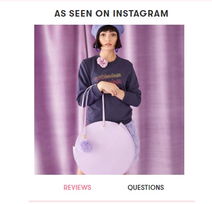
The product pages seem well optimized and have this little snippet below them titled “As seen on Instagram”. This adds to the social proof and gives the chance to the visitor to connect with your social media pages and maybe even follow you there.
Ban.do is a fun lifestyle store and the creativity behind all the ideas and products makes it appear on our list.
5. PURA VIDA BRACELETS
When you have hundreds of products on your store, you definitely need great filtering functions incorporated into your e-commerce store. This way, you visitors won’t become overwhelmed with so many options. Pura Vida Bracelets does just that.
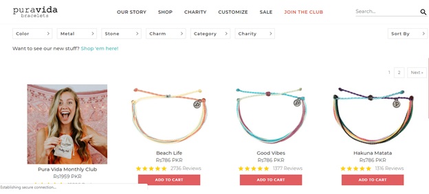
This helps the visitor choose right down to the charm and color and the stone that they require in their products.
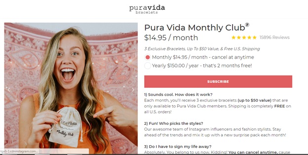
Another interesting tactic that Pura Vida uses is a subscription box. At $14.95 a month for 3 months, the exclusive subscription box is a great way to target the customers and create brand loyalty.
The Puravida product pages also show a “Styled on Instagram” tab for the customers adding social proof to the website.

This store is also fun, exciting and vibrant and hence makes it to our list for its innovative designs and techniques.
Let us know what stores you loved most this year and why you liked them in the comments below!